Building a Brand Design System with Model Context Protocol: Guidelines, Assets, Component Library, and AI Readiness
A cohesive brand identity is essential for creating consistent, memorable, and scalable user experiences. Your brand design system serves as a centralised framework that unifies design principles, visual assets, and components to ensure consistency across platforms and touchpoints. Integrating a Model Context Protocol (MCP), a structured approach to managing contextual data and interactions in AI-driven systems, into a brand design system enhances its adaptability and scalability, making it AI-ready for dynamic, intelligent applications. Here we outline the process of building a brand design system with MCP, including guidelines, assets, a component library, and considerations for AI readiness.
The Model Context Protocol is a framework designed to standardise how AI models interpret, process, and respond to contextual data. It ensures that AI systems can dynamically adapt to user needs, environmental variables, and platform-specific requirements. In the context of a brand design system, MCP enables AI-driven personalisation, accessibility, and scalability by providing a structured way to manage design tokens, components, and user interactions. By embedding MCP, the design system becomes a living ecosystem that evolves with user behaviour and technological advancements.
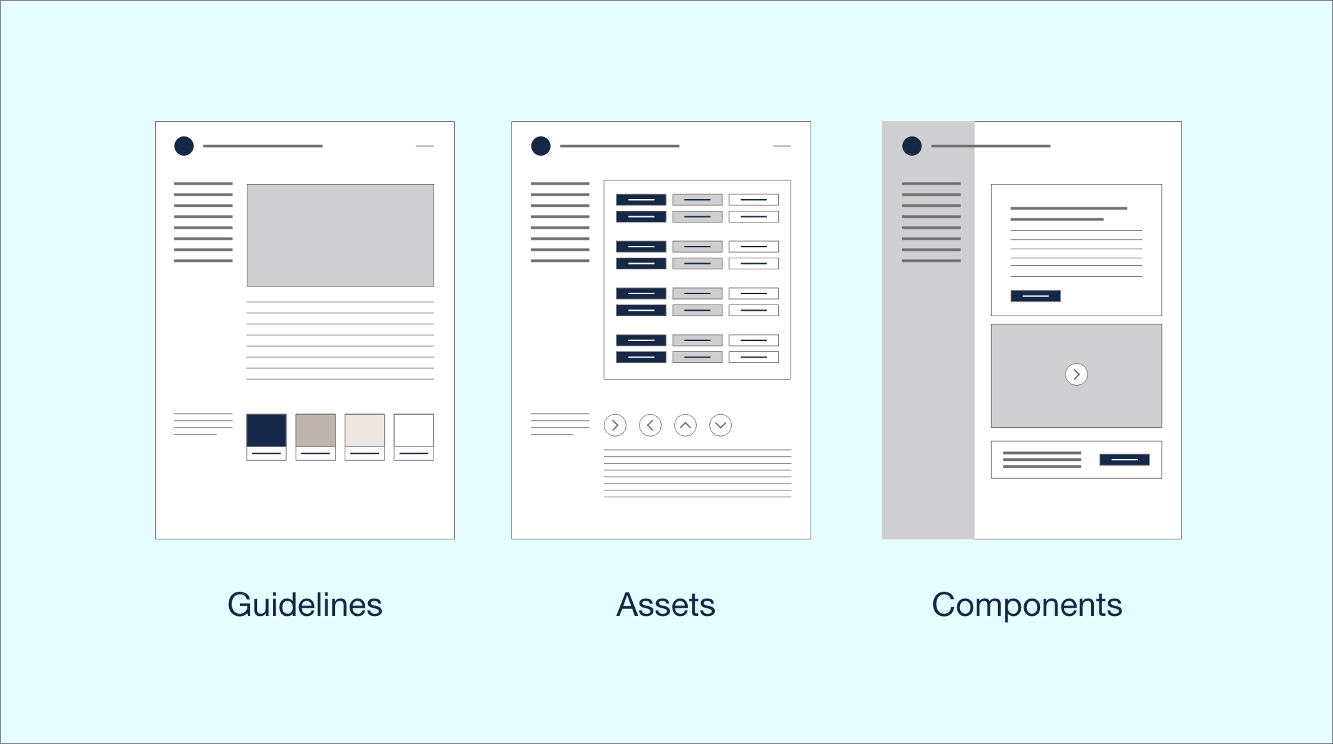
A brand design system comprises guidelines, assets, and a component library, all of which must align with the brand’s identity and be optimised for AI readiness. Below, we explore each element and how MCP enhances their functionality.
2.1 Guidelines
Guidelines form the foundation of the design system, providing rules and principles that govern its use. These include:
Brand Identity Principles: Define the brand’s mission, values, tone, and visual style (e.g., colour palettes, typography, imagery guidelines).
Accessibility Standards: Ensure compliance with WCAG 2.1 or higher, including contrast ratios, font sizes, and keyboard navigation. MCP can enhance accessibility by dynamically adjusting UI elements based on user preferences (e.g., increasing text size for visually impaired users).
Usage Rules: Specify how and when to use design elements, such as logo placement, spacing, and responsive behaviour across devices.
AI Interaction Guidelines: With MCP, guidelines should include rules for AI-driven interactions, such as how the system adapts layouts or prioritises content based on user context (e.g., location, device, or behaviour).
MCP Integration: MCP ensures guidelines are machine-readable and context-aware. For instance, design tokens (e.g., colour values, spacing units) are stored in a structured JSON format compatible with MCP, allowing AI systems to dynamically apply them based on user data. This structure allows AI to adjust the design system in real-time, ensuring accessibility and personalisation.
2.2 Assets
Assets are the visual and functional building blocks of the brand, including:
Logos and Icons: Scalable vector graphics (SVGs) for logos, favicons, and icon sets. Icons should be designed with consistent stroke weights and sizes (e.g., 24x24px grid).
Imagery: Photography, illustrations, and patterns that reflect the brand’s aesthetic. Include guidelines for image resolution, aspect ratios, and alt text for accessibility.
Design Tokens: Reusable variables for colours, typography, spacing, and shadows. Tokens are critical for consistency and scalability, especially in AI-driven systems.
MCP Integration: Assets are tagged with metadata that MCP can interpret, enabling dynamic selection based on context. For example, an AI system might choose a high-resolution logo for a desktop display or a simplified icon for a mobile interface. This ensures assets are contextually relevant and optimised for performance.
2.3 Component Library
The component library is a collection of reusable UI elements, such as buttons, forms, cards, and navigation bars, built to reflect the brand’s design language. Each component should be:
Modular: Components are independent and composable, allowing developers to mix and match them.
Responsive: Built to adapt to different screen sizes and devices.
Accessible: Components meet accessibility standards, with proper ARIA labels and keyboard support.
Documented: Include usage examples, code snippets, and variants (e.g., primary, secondary, disabled states).
MCP Integration: Components are designed with MCP-compatible APIs that allow AI systems to modify their behaviour or appearance based on context. For example, a button component might change its colour or text based on user preferences or environmental data. This ensures components are flexible and AI-ready, capable of adapting to real-time data.
To make the design system AI-ready, it must leverage MCP to support dynamic, intelligent, and scalable interactions. Below are key considerations:
3.1 Dynamic Adaptation
MCP allows the design system to adapt to user context, such as location, time of day, or user behaviour. For example, an e-commerce brand might prioritise product cards based on a user’s purchase history or adjust the UI for nighttime viewing (e.g., enabling dark mode). This requires:
Context-Aware Tokens: Design tokens that respond to MCP signals, such as switching colour schemes based on user settings.
Personalisation Rules: Define how components adapt to user data, such as displaying localised currency or language.
3.2 Scalability and Modularity
An AI-ready design system must be scalable across various platforms (web, mobile, IoT) and modular, to support the addition of new components or features. MCP ensures components are decoupled and reusable, with APIs that allow AI systems to extend functionality without breaking the system.
3.3 Real-Time Data Integration
MCP enables integration with real-time data sources, such as user analytics or external APIs. For example, a news app’s design system might use MCP to prioritise breaking news stories based on user interests, fetched via an API and rendered dynamically.
3.4 Testing and Validation
AI readiness requires rigorous testing to ensure that components behave correctly under varying contexts using automated testing tools to simulate MCP-driven scenarios, such as different user profiles or device types. Validate accessibility and performance to ensure the system remains robust.
1. Define Brand Guidelines: Establish brand identity, accessibility, and AI interaction rules. Use MCP-compatible formats (e.g., JSON) for guidelines and tokens.
2. Create Assets: Design logos, icons, and imagery with metadata for MCP integration. Store assets in a centralised repository (e.g., Figma, cloud storage).
3. Build Component Library: Develop modular, responsive components using frameworks like React or Vue.js. Ensure components are MCP-compatible with context-aware APIs.
4. Integrate MCP: Embed MCP logic to enable dynamic adaptation, such as adjusting UI based on user context or real-time data.
5. Test and Iterate: Test the system across platforms and contexts, using AI-driven simulations to validate performance and accessibility.
6. Document and Train: Provide comprehensive documentation and training for designers and developers to use the system effectively.
ATTENTION
In a crowded digital landscape, brand design must immediately grab attention to stand out by leveraging visuals, typography, and imagery to create an emotional spark. This could be a vibrant social media post, a sleek website header, or even a catchy tagline that resonates with your target audience. The goal is to stop the scroll, spark curiosity, and make your audience want to explore more.
INTEREST
Once attention is secured, brand design shifts to fostering interest by weaving a compelling narrative. This is where your brand’s personality shines through consistent visuals, tone, and messaging. Interest is sustained by ensuring every customer touchpoint reflects your brand’s core values, creating a sense of familiarity and trust that keeps your audience engaged.
DESIRE
The desire phase in brand design is about making your audience want to be part of your brand’s world. This is achieved by crafting visuals and experiences that tap into their aspirations or emotions. By aligning the design with the audience’s lifestyle or ambitions, the brand becomes more than just a product, it becomes a symbol of identity, driving a deeper emotional connection.
ACTION
The final step is prompting action, whether it’s a purchase, a sign-up, or sharing content. Brand design facilitates this by making the call-to-action (CTA) clear, visually prominent, and seamlessly integrated. Design consistency across platforms ensures trust, while intuitive UX design removes barriers to action. Ultimately, brand design transforms passive viewers into active participants.

We build future-proof brands for businesses by providing strategic thinking and design support for every step of the customer journey.
Spaces Jubilee House, Third Avenue, Marlow SL7 1EY
Privacy Policy | Website Terms